1800Flowers
Florists.com Redesign for Seamless Upsell & Higher Revenue
Introduction
This case study outlines the business objectives and outcomes of my work redesigning Florists.com to increase revenue, improve user experience, and elevate UI. The redesign strategy focused on adding upselling features to nudge users to purchase larger-size flower bouquets and enhancing user interface elements like shipping details and customization options.
Role: Lead Designer
Interactive Prototype
Click the Prototype Below to Explore
Business Initiatives & Outcomes
Upsell Smaller-size Product Purchase
Customer Goal: To feel satisfied with their purchase and ensure the receiver is happy with their gift.
Business Goal: Encourage users to opt for larger-size arrangements to improve customer satisfaction and reduce complaints, addressing the discrepancy in quality and fullness between basic and premium arrangements.
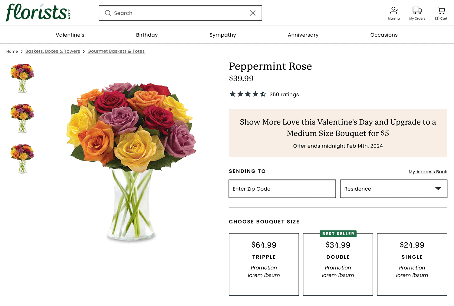
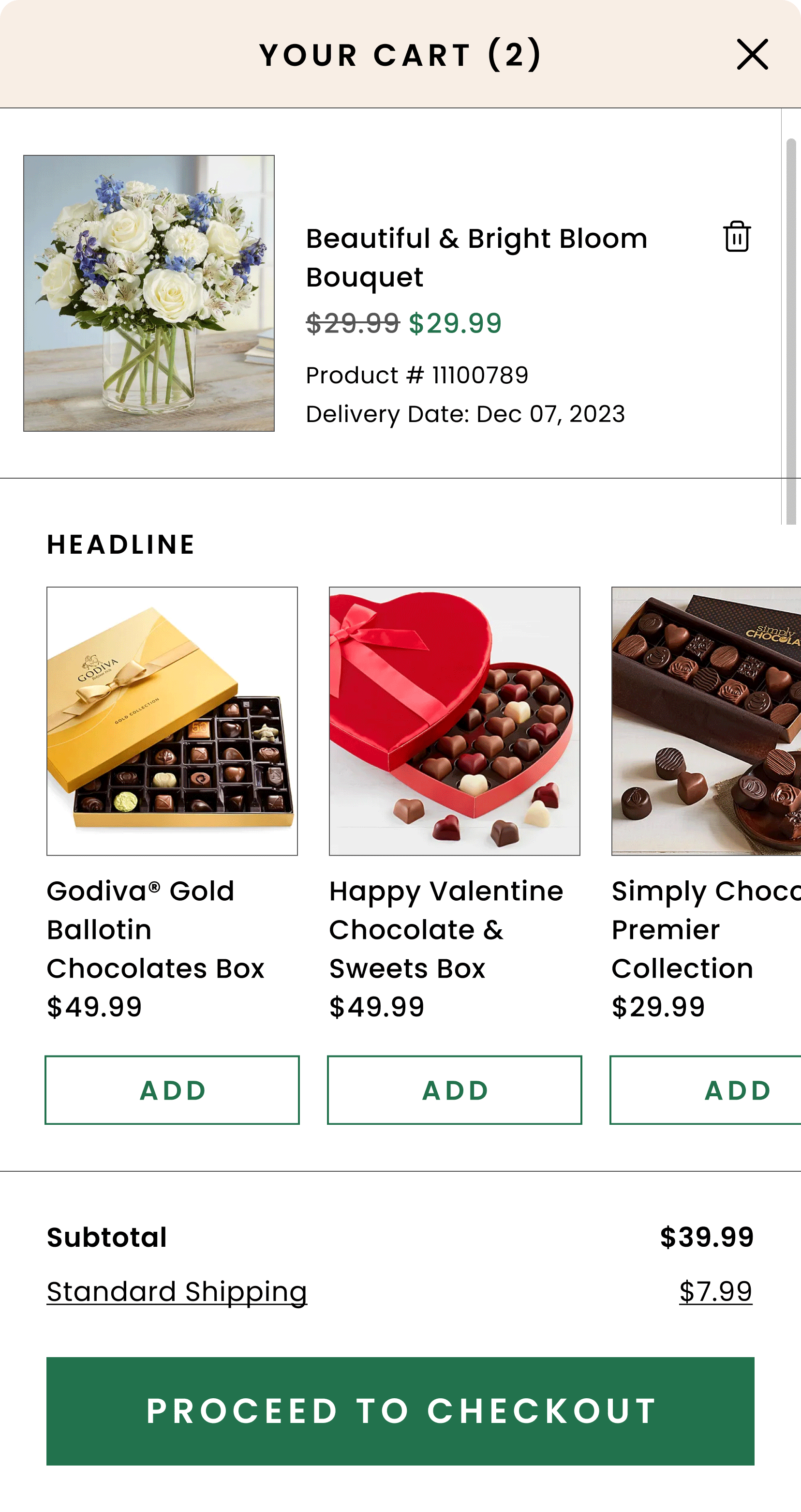
Outcome: To boost upselling on the website, we implemented the "rule of three" by offering pricing and product options, utilized social proof with bestseller badges, and created urgency with limited-time offers to guide users toward premium selections, streamlining their decision-making process.
See the strategy and competitor analysis presentation link.
Educate the Customer About Shipping Fees
Customer Goal: Gain a clear understanding of shipping and fee structures to ensure confidence in finalizing purchases without unexpected costs.
Business Goal: Increase purchase completions and reduce cart abandonment by transparently communicating costs.
Outcome: To clarify the shipping and fee structure for users and ensure confidence in their purchases, we created a campaign-style promotional block on the Product Detail Page (PDP). This block detailed the fee structure and delivery process, using imagery of florists to enhance confidence and reinforce brand identity. Precise shipping fee details are also included directly above the date selection element, simplifying the fee structure for the user.
Shape and Rebrand UI
Customer goal: Engage with an elevated aesthetic, enhancing the user experience.
Business Goal: Align the UI with the brand's identity to reinforce brand recognition and cohesion.
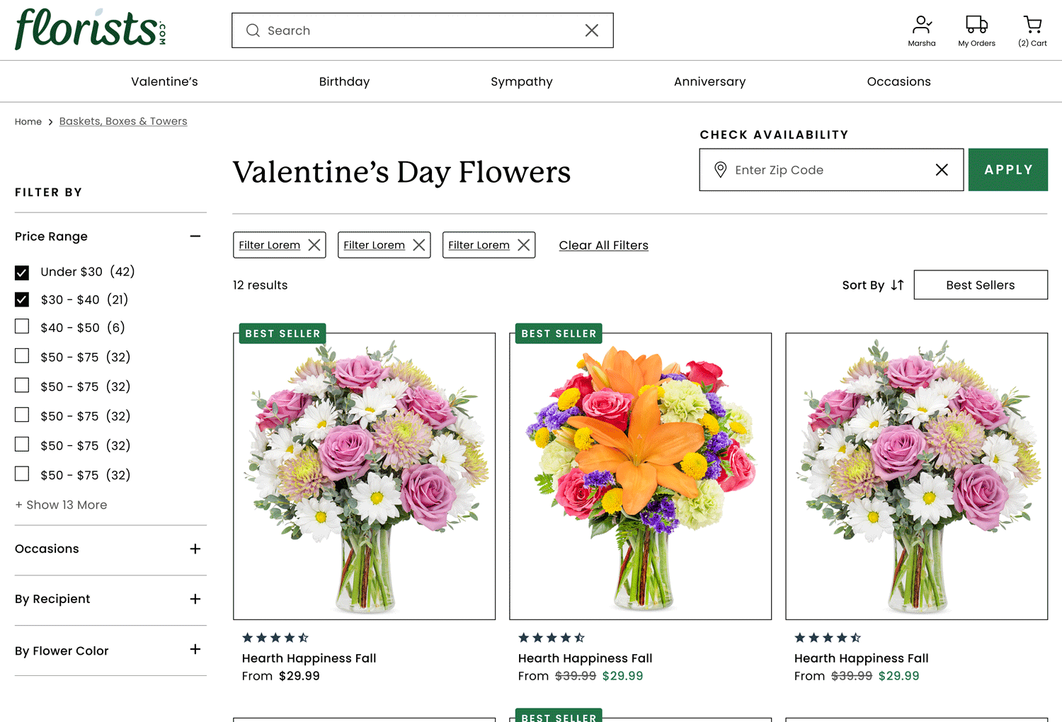
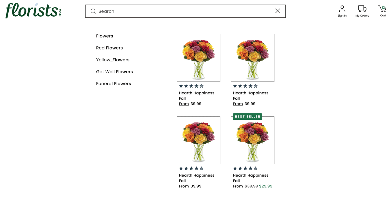
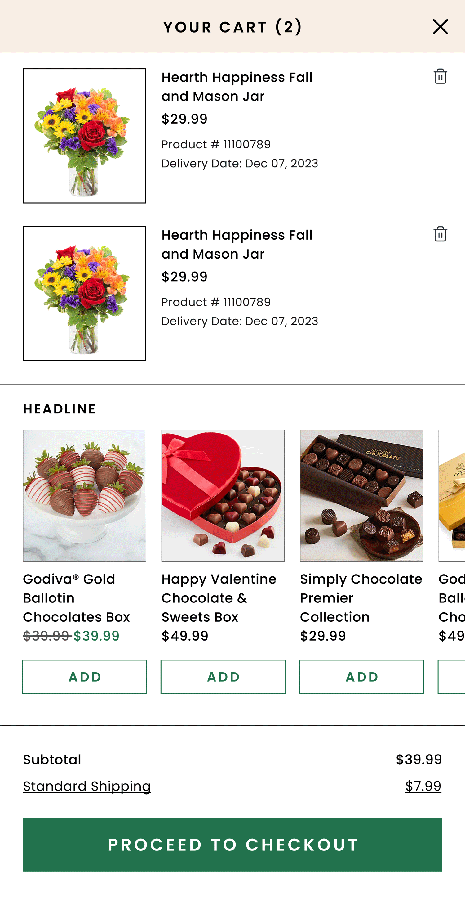
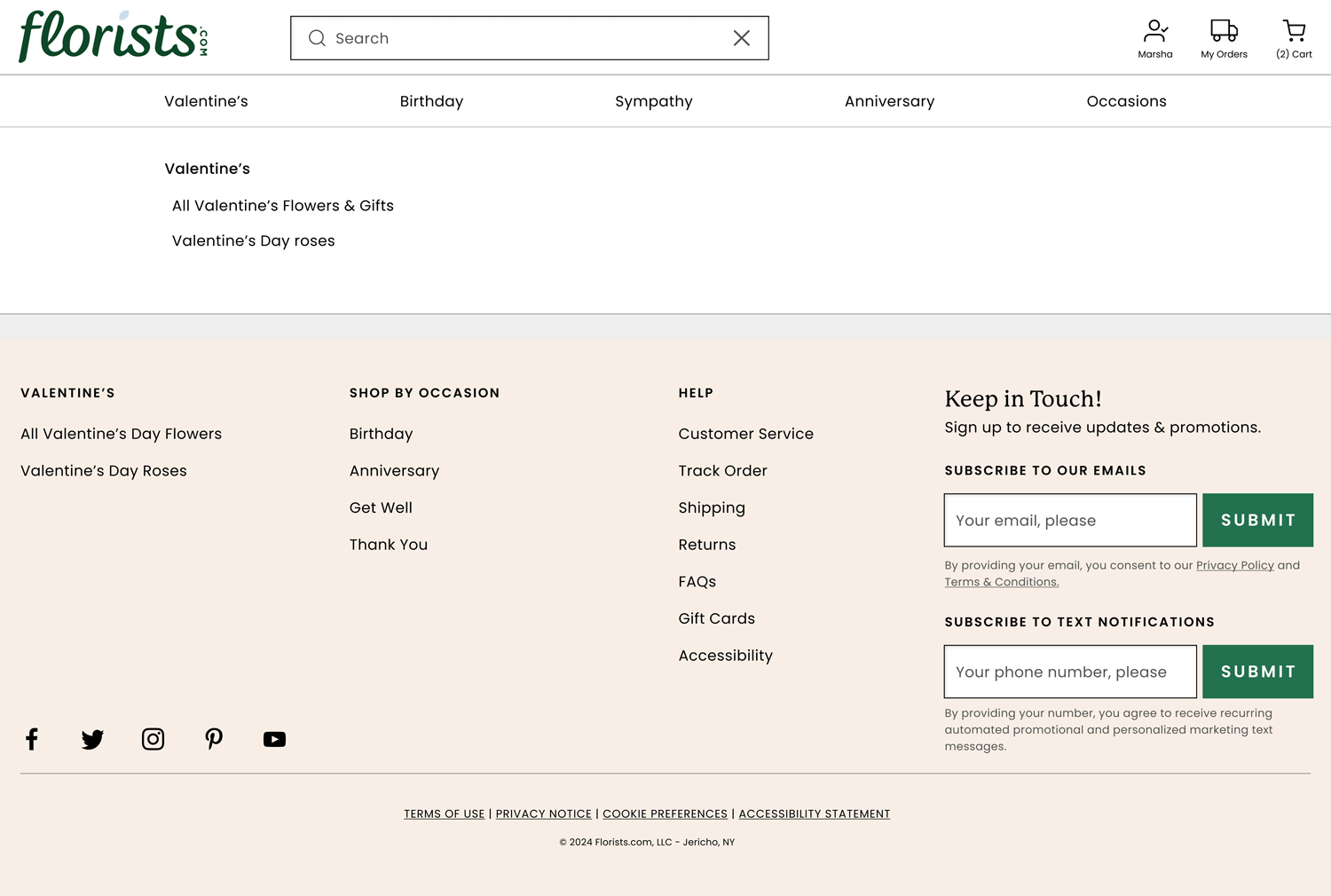
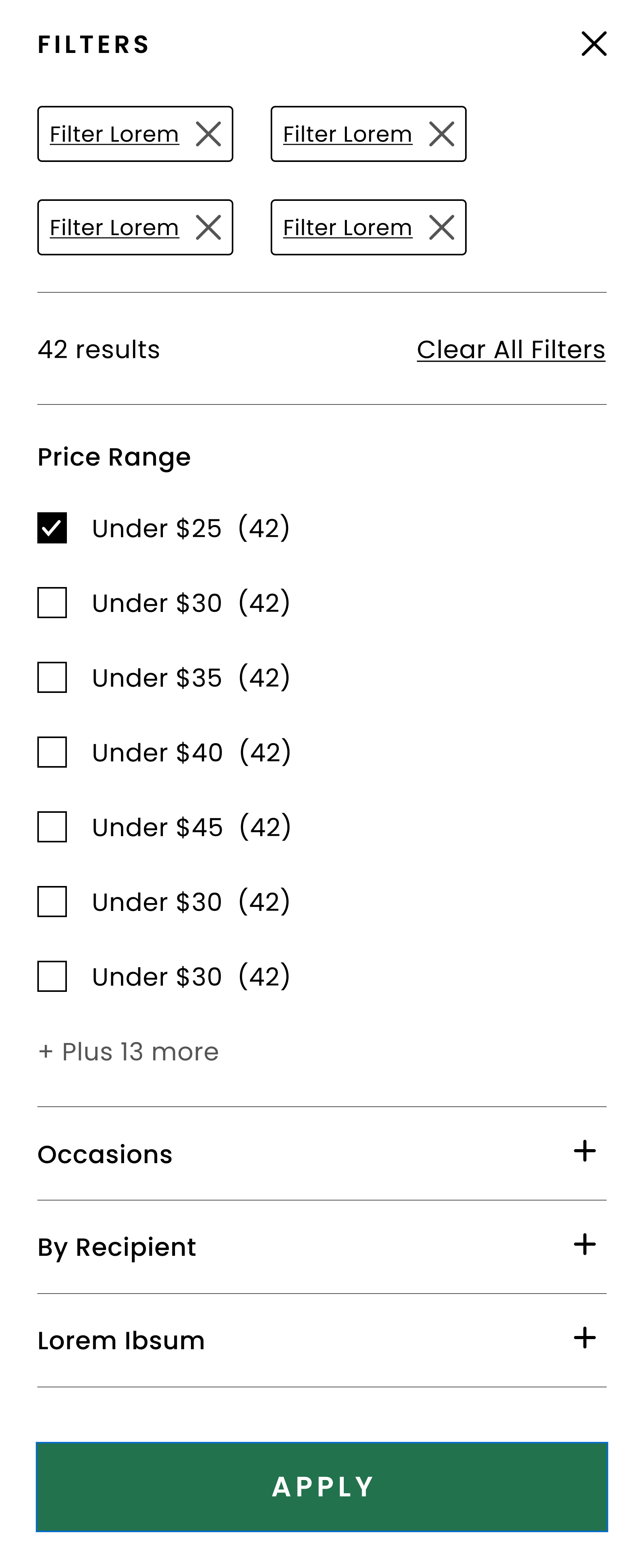
Outcome: The redesign encompassed the product display page, catalog page, header, navigation, footer, search, and filter features, as well as zip search functionality that enables the filtering of products by delivery area. This design sets itself apart from other 1800Flowers brands with its minimalist approach and clean layout. The mobile design was further enhanced with parallel navigation, minimizing the users' need to access the menu through the hamburger and reducing the number of clicks to buy.
Show Zip Coverage to the User Going Into the Holidays
Customer Goal: Access clear information on delivery availability by zip code for specific dates, especially around holidays.
Business Goal: Increase transparency and reliability in delivery options, improving user trust and reducing order hesitancy.
Outcome: We updated the calendar component to feature three states tailored for holiday periods, giving users alternative shipping choices and enhancing transparency and decision-making.
Give Flexibility to the User to Create an Arrangement
Customer Goal: Empower users to customize their floral arrangements.
Business Goal: Enhance customer engagement and satisfaction by offering personalized arrangement options.
Outcome: We created a streamlined design that allows customers to select two types of flowers and a vase, enabling them to create a personalized bouquet. Above the functionality, a text block provides instructions for the user.
Collaborative Efforts & Implementation
Working closely with multidisciplinary teams was vital for maintaining a unified design vision. This collaboration was essential for merging insights, aligning design goals, and effectively tackling challenges, ensuring cohesive, user-aligned solutions.
Figma Handoffs: Regular dialogues with developers were instrumental in addressing challenges, aligning priorities, and fostering cohesive execution.
Quality Assurance: Post-development reviews were conducted to align the final product with initial prototypes, ensuring design consistency.
Ongoing Collaboration: Explicit task tracking was facilitated for accurate design realization
Conclusion
In conclusion, my work on Florists.com’s UX/UI redesign demonstrated the powerful impact of strategic design on user satisfaction and business metrics. Meeting business goals, my team and I significantly contributed to the brand’s revenue growth by enhancing upselling features, clarifying shipping information, and offering customization. The project underscored the importance of a user-centered approach in creating a cohesive, engaging online experience that aligns with the brand’s identity and business goals.


