
ELOQUII UX Redesign:
Fostering Inclusivity & Streamlining Complex User Journeys
Overview
Plus-size online shoppers frequently encounter inconsistent sizing, return, exchange difficulties, and limited product discovery, which impede a genuinely inclusive, aspirational shopping experience.
ELOQUII, which operates under Walmart, identified these issues as critical weaknesses in its platform. These issues negatively affected consumer confidence, retention, and revenue potential. Additionally, the company’s accessibility shortcomings led to legal action, reinforcing the need for a fully inclusive shopping experience that meets diverse user needs.
Using a user-centered approach and insights-based strategies, I aimed to address these user challenges, meet business goals, and elevate the shopping experience.
Role: Lead UX/UI Designer
/Discovery/Research/Patterning/UX Strategy/Low to High Fidelity Prototyping/Hand-off Documentation Creation.
Key Highlights
User Concerns: Pain points around returns, product discovery, and accessibility caused a decline in user confidence as well as retention.
Design Approach & Goals: Leveraged a user-centered approach and insights-based strategies to address user challenges, meet business goals, and elevate the shopping experience.
Customer & Business Context
ELOQUII caters to refined plus-size consumers who often find mainstream retailers’ websites limited and frustrating. Conventional and inconsistent sizing causes user uncertainty, leading to cart abandonment or prompting users to purchase multiple-size products to find the right fit, increasing return hassles.
ELOQUII’s mission is to provide plus-size consumers with a seamless, user-centered experience that promotes clarity, accessibility, and confidence. However, user research and UX support logs showed that consumers were frustrated by many functionality inadequacies and confusing user pathways on the site.
Among the most predominant pain points users reported were the returns process and account section complexities, leading to a loss of user confidence and greater dependence on customer service. Poor product discovery and insufficient filtering options were other sources of frustration, hindering shoppers’ ability to find relevant products easily. Additionally, accessibility compliance issues were prevalent, bringing a lawsuit against the company. Instituting high accessibility standards was another top priority in the redesign effort.
Ultimately, confronting the gaps in returns processes, account management, and accessibility is essential to reinforce ELOQUII’s commitment to plus-size inclusivity. The company can boost user satisfaction, encourage repeat business, and support sustainable growth by removing barriers and prioritizing a seamless shopping journey.
Key Highlights
User Concerns: Research revealed problems with complex returns, disjointed account sections, product discovery limitations, and accessibility shortcomings.
Design Approach & Goals: Focused on boosting user confidence, improving satisfaction, and driving higher revenue through a user-centered strategy.
Closing Gaps: Simplifying key touchpoints, resolving accessibility issues, and enhancing user confidence and loyalty.
Approach & Methodology
Interactive Prototype
I adopted an iterative, data-driven approach, beginning with a thorough review of historical user data and support call logs to assess shoppers’ friction points on the existing site. I also conducted competitor analysis and studied plus-size retailers and mainstream fashion e-commerce leaders, identifying e-commerce best practices.
Based on the insights gathered, I used Figma to design low-fidelity wireframes for key pages, including the home page, catalog, product pages, navigational landing pages, returns hub, and an onboarding flow. These wireframes were refined into high-fidelity prototypes that adhered to WCAG 2.1 AA guidelines through iterative feedback sessions with product and CX stakeholders.
I measured quantitative goals alongside qualitative feedback to inform each project phase. Although the formal A/B testing and usability studies were not conducted, I leveraged industry benchmarks to project outcomes. For example, simplified product discovery flows often correlate with higher conversion rates and average order value, making it easier for users to find products. Similarly, a streamlined returns experience reduces support calls and increases repeat purchases by enabling a hassle-free return and encouraging customers to shop again. Every design decision was anchored in proven e-commerce standards to elevate shopper confidence and align the site’s experience with ELOQUII’s long-term growth objectives.
Key Highlights
Data-Driven Insights: Analyzed qualitative feedback, support logs, and site metrics to guide design priorities.
Quantitative objectives: Leveraged industry benchmarks to align the site’s experience with the company’s growth targets.
Iterative Collaboration: Translated stakeholder input into evolving prototypes, maintaining a user-centric approach throughout the design cycle.
Key Design Solutions
Refining the Return Process

One of the key insights that emerged from shopper feedback was that plus-size customers often order multiple sizes to find the correct fit. Yet the ELOQUII’s site return process was lengthy and complex, frequently sending the user in loops and encountering numerous error messages, causing frustration and declining repeat purchases.
I addressed these issues by streamlining the flow—cutting the number of clicks by more than half and minimizing unexpected errors—and clarifying the journey with progress indicators and more straightforward language. As a result, the new returns process is projected to lower customer service inquiries, instill greater user confidence, and improve overall satisfaction by 20–30%, further encouraging repeat purchases and supporting ELOQUII’s long-term growth goals.
Key Highlights
Streamlined Returns Flow: Streamlined return process by reducing steps, significantly minimizing user frustration.
Error-Free Experience: Eliminated unexpected, frustrating error messages, providing a straightforward path for users to manage returns.
Projected Gains: Estimated a 20–30% boost in user satisfaction, reflecting faster resolution times and fewer support calls.
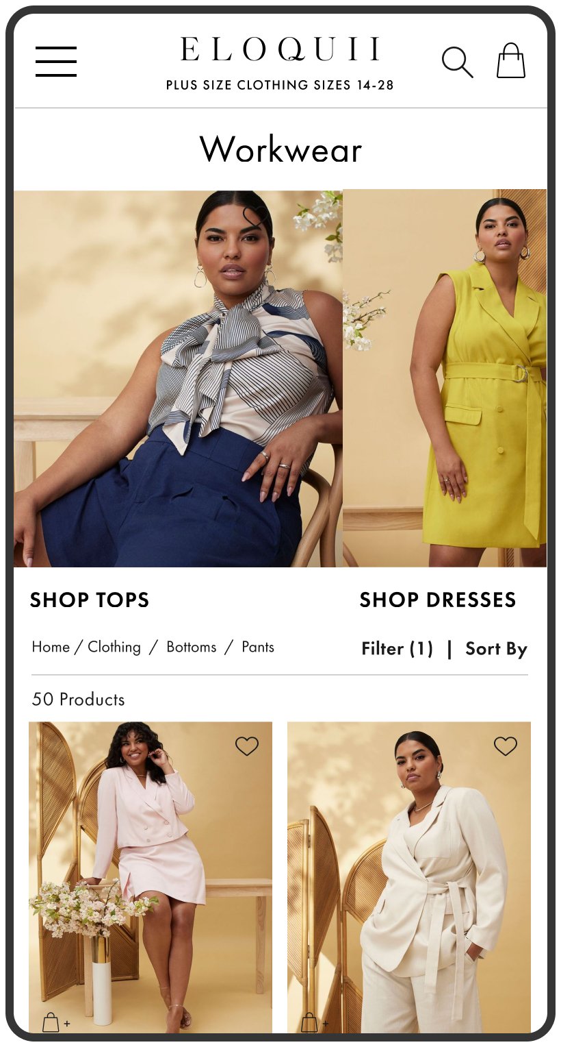
Enhancing Product Discovery
ELOQUII’s broad size range and body shape options are a strong selling point—provided users can quickly locate styles that match their preferences. However, the existing platform’s limited filtering options and hidden subcategories led to frustrating searches. I created landing pages with prominent visual filters that surface subcategories and secondary navigation elements to refine selections by silhouette. These enhancements significantly reduce friction and streamline product searches. Based on industry benchmarks, I estimated a 20% rise in user satisfaction, reflecting faster product discovery, fewer abandoned carts, and a more substantial likelihood of repeat purchases.
Key Highlights
Improved Navigation & Discovery: Introduced navigational landing pages with subcategory filters.
Contextual Fit Navigation: Added secondary navigation, further narrowing selection by three silhouette categories.
Projected Satisfaction Gains: Shortening search times and lowering abandonment rates is estimated to lift user satisfaction by 20%.


Elevating the Platform Aesthetic

Home Page
Landing Page

Catalog Page

Product Page
Beyond functional improvements, I elevated the UI design, creating a visually elevated, user-focused experience. Previous site elements like homepage visual imagery and text were misaligned, lowering engagement and undermining brand credibility. Missing headlines for sections like Shop by Category made it difficult for users to understand the page content, creating usability issues with improper use of H tags. Additionally, some colors failed to meet WCAG standards, causing accessibility barriers.
I identified brand color combinations that met WCAG standards, recommended heading placements, and UX copy improvements to maintain proper hierarchy and clarity. To align with ELOQUII’s high-end brand positioning, I increased spacing to introduce additional white space—a design technique often used in luxury retail experiences to enhance perceived quality and improve user focus.
My design improvements were meant to position ELOQUII as fashion-forward and inclusive—two elements that are not always integrated into plus-size fashion. If the site had been launched and measured, I estimated these enhancements could increase perceived brand quality by 25–35%, supported by user surveys or Net Promoter Score (NPS) data.
Key Highlights
Elevated Layouts: Created elevated UI design to enhance perceived quality and improve user focus.
Improved Usability: Ensured brand color combos met WCAG standards, introduced consistent heading hierarchy, and refined UX copy for clarity.
Projected Gains: Estimated a 25–35% increase in perceived brand quality.
Account Management Flow


Managing personal information, order history, and saved preferences was inefficient on the old platform, where fragmented navigation and ambiguous pathways frequently frustrated users. I integrated real-time validation to catch errors and introduced in-context help, giving users quick access to information with tooltips and pop-ups. The updated account section details the complete order and returns history, shipping status, saved addresses, payment, communication preferences, favorites, and rewards sections. By prioritizing ease of navigation, organized information architecture, and helpful user feedback, these enhancements ensure that an account section is functional, intuitive, secure, and confidence-building—ultimately fostering user loyalty and repeat engagement. These enhancements minimized confusion, lowered support inquiries, and strengthened user loyalty by providing a more seamless account experience.
Key Highlights
Simplified Navigation: Reorganized account features under clear headings, reducing confusion and improving discoverability.
Enhanced Usability: Introduced real-time validation and in-context help (tooltips, pop-ups) for smoother, error-free interactions.
Implementation & Collaboration
Throughout the project, I worked closely with product managers, developers, and CX leads to ensure the design stayed user-focused and aligned with ELOQUII’s objectives. Regular feedback loops and design reviews were crucial for maintaining transparency and ensuring evolving design decisions met user and business needs. Figma was the central design hub for collaborative work sessions and design reviews with stakeholders. Jira was used to provide developers with detailed specifications, ensuring clear communication, streamlined workflows, and improved collaboration. This approach enabled alignment and teamwork, ensuring everyone worked together with shared clarity.
Key Highlights
Collaborative Development: Partnered with product, dev, and CX teams to maintain a user-first perspective.
Design Handoff & Alignment: Leveraged Figma for consistent, high-fidelity specs, streamlining the workflow.
Reflections & Results
My guiding principle throughout this project was a commitment to customer obsession. This meant continually asking myself: “What does the shopper truly need, and how can I reduce friction at every turn?” By combining data-driven insights with empathy for plus-size consumers, I provided solutions to critical challenges, streamlined complex workflows, and enhanced inclusivity throughout the shopping journey.
Reflecting on the process, several key insights emerged as critical. ELOQUII shoppers’ challenges—limited navigation, unclear pathways, and accessibility gaps—underscored the need for clear, structured user flows to reduce frustration and build confidence. Ensuring strong visual contrast, straightforward navigation, and a well-defined hierarchy proved essential in creating a supportive and welcoming experience for all users. Together, these improvements illustrated the transformative potential of user-centered design to eliminate barriers, address pain points, and fulfill a brand’s promise of inclusivity.
Early stakeholder feedback highlighted the potential impact of these efforts, with projections indicating a 20–30% increase in user satisfaction and a 25–35% boost in perceived brand quality. These findings underscored the value of a user-first approach in driving both business and user outcomes. The following steps would include targeted usability sessions to validate our hypotheses, refine features, and further enhance accessibility, along with additional A/B testing to measure real-world impact. This direction also supports ELOQUII’s broader aim to stand out in plus-size fashion. Ultimately, this project demonstrated how empathy, accessibility, and data-driven insights can bring meaningful improvements to online retail—particularly for an underserved audience seeking a seamless, inclusive shopping experience. These learnings will continue to inform future e-commerce projects, ensuring a consistent commitment to user-centered design and ongoing innovation.
Key Highlights
Empathy-Driven Approach: Combined data-driven insights with empathy for plus-size consumers to address pain points, simplify complex workflows, and create an inclusive, user-friendly experience.
Measured Potential: Projections indicated a 20–30% rise in user satisfaction and a 25–35% lift in perceived brand quality, underscoring the value of a user-centered approach.
Forward-Looking Validation: Usability studies and A/B testing would have been the next steps to validate and refine the design, ensuring continuous improvements.