
1800Flowers Enterprise
Personalization Journey
Introduction
Despite rising user expectations for personalized shopping experiences, 1‑800‑FLOWERS Enterprise fell behind competitors like Wayfair in delivering relevant content—missing opportunities to boost revenue and user satisfaction. A three-phase plan was established to roll out Salesforce’s machine learning personalization technology across the enterprise: first, secure senior leadership approval; second, validate the personalization strategy; and finally, build a fully personalized homepage for side-by-side testing.
Phase 1: Create an out-of-the-box homepage design demonstrating how personalization can boost engagement and revenue to secure leadership buy-in.
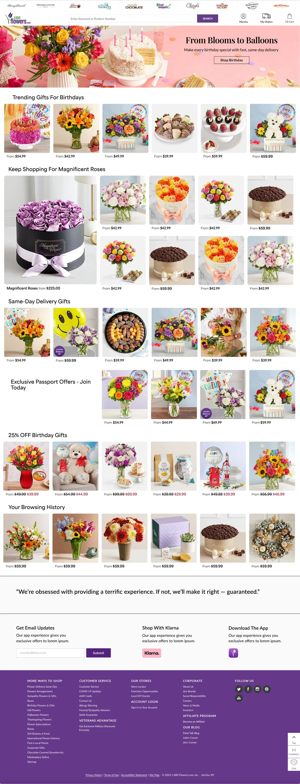
Phase 3 MVP: Design a personalized home page driven by Salesforce’s machine learning. Currently in development, it will be tested against the current homepage.
Phase 3 MVP: Design a personalized home page driven by Salesforce’s machine learning. Currently in development, it will be tested against the current homepage.
Goals and Key Metrics
We ran targeted tests to refine our strategies and gain insights into user preferences and behaviors, shaping our design decisions. Based on these insights, we aimed to display relevant products on the homepage dynamically, notify customers of upcoming gifting occasions, and suggest personalized gifts—streamlining selection and boosting conversions.
Recently Viewed Products: Used older, static components to see if displaying previously viewed items would increase engagement and add-to-cart actions. The team targeted a 3–5% lift in user engagement and aimed to validate whether surfacing browsing history could raise overall revenue per visitor.
Shorter Recommendation Lookback Window: Reduced the timeframe from 14 to 7 days, intending to show more immediate, relevant suggestions. The goal was a 1–2% boost in direct revenue and a 2–3% increase in user engagement, with minimal impact on conversion.
Grid vs. Carousel Layout: Compared stacked grids to carousels for “Recently Viewed” items across devices, seeking a modest engagement gain (around 50 basis points in click-through) on both desktop and
Old Home Page

MVP

Requirements
The requirements are that modules be fully modular, integrate with Contentstack for streamlined content updates, and leverage Salesforce personalization to deliver relevant, timely experiences. The bullet points below detail each element, focusing on reusability, flexible configurations, and data-driven targeting to adapt these modules to user behaviors and evolving business needs.
Personalized Homepage Modules: Present reminders, predictive guidance, and tailored content based on recent user activity, ensuring shoppers see relevant offers and reducing browsing friction.
ContentStack Integration: Leverage a flexible content management system to quickly update and manage these modules, minimizing development overhead and maintaining brand consistency.
Streamlined User Flows: Highlight upcoming occasions or recently viewed products, giving new and returning customers fast access to meaningful gift options.
Iterative Testing & Refinement: Establish ongoing A/B tests or similar experiments to fine-tune functionality and layout based on real-world usage and evolving business goals.

This modular, card-based UX design includes 2-, 3-, and 4-column layouts for promotional cards, product cards, headline modules, and “silos” category modules. Contentstack’s headless architecture powers each component with structured data and fields, ensuring consistency and easy updates. The system automatically delivers personalized content by integrating Salesforce data and machine learning models, serving each user's most relevant cards and modules in real-time.
Competitive Analysis & Patterning
I evaluated leading platforms to understand how they personalize user experiences without compromising intuitive browsing. This included examining the use of real-time data, filtering options, and recommendation carousels that guide shoppers toward relevant products.
Amazon: Greets users by name, offers horizontally scrollable product suggestions, and bundles frequently bought-together items to encourage higher cart value.
Airbnb: Maintains a persistent search bar, features horizontally scrollable categories, and uses infinite scrolling to foster continuous exploration.
These insights informed our 1‑800‑FLOWERS.COM approach to surfacing relevant gifts, reminding users of upcoming occasions, and ensuring a smooth, scroll-friendly journey.
The Pitch
Phase 1
I was tasked with creating an out-of-the-box “secret” personalized home page design concept, free of enterprise systems constraints. The design challenge was to surface products from 1800Flowers and all seven sub-brands on one centralized home page, enhancing the user product discovery experience and supporting cross-selling strategies, maximizing revenue potential.
Concept Design Feature Highlights:
AI search and a personalized category carousel with user-targeted suggestions replace the menu and offer tailored product suggestions to the user to streamline discovery.
Full category menus for all brands are organized in tabs and moved to the page's footer as a secondary menu.
Address book integrated feature that predicts users' upcoming occasions and makes targeted product suggestions.
Infinite scrolling to foster continuous exploration.
Validating Personalization Strategy
Phase 2
In phase two, we set out to validate our personalization strategy by building on the earlier test, Recently Viewed Products, which yielded a $6 lift in revenue per visitor and a 7% increase in engagement using outdated product carousel modules. This high-visibility project involved cross-functional collaboration between UX, Personalization, and the creative department, who were the owners of the existing home page and oversaw branding.
Working under the same hypothesis that a tailored experience would produce greater user satisfaction and measurable business results, this next phase aimed to create an integrated modular component system that not only aligned with the branding but elevated the page's look.
Old Home Page Modules
New Home Page Modules
Design Process
Phase 2
The design process was highly iterative and rooted in ongoing strategy, UI A/B testing, and stakeholder feedback. To ensure stakeholder alignment, UI design decisions between stacked products and carousels were A/B tested.
The mid-fidelity designs investigated UI elements, grid variations, the use of color blocks, and brand-aligned photography, exploring options to minimize the components' footprint on the home page so as not to “push down” editorial content and uphold brand alignment.
The mid-fidelity designs investigated UI elements, grid variations, the use of color blocks, and brand-aligned photography, exploring options to minimize the components' footprint on the home page so as not to “push down” editorial content and uphold brand alignment.
I used a minimal approach in my design, utilizing the 1800Flowers grid system and brand colors to align design consistency. The final design iteration incorporated a button as an interactive element that allowed users to view more or fewer products, defaulting to one row, minimizing space, and allowing them to review their recommendations further.
Personalization Strategy
Phase 2
We utilized a waterfall personalization strategy that first populates the interface with recently viewed items. The remaining space is filled with targeted recommendations if the user’s recent view threshold is unmet. This ensures a consistent, data-driven experience that prioritizes personal history while adapting to varying levels of user interaction data.
Customer with 1 recently viewed product: Recommendations take up the entire grid.
Customer with 3 recently viewed products: Both Recommendations and Recently Viewed experiences are displayed.
Customer with recently viewed products: Both Recommendations and Recently Viewed experiences are displayed
Implementation
Phase 2
I worked closely with development during the implementation stage of phase two, beginning with handoff notes detailing CSS specifications, visual references of design spacing through QA, and additional iterations.


Outcome
Phase 2
I worked closely with development during the implementation stage of phase two, beginning with handoff notes detailing CSS specifications, visual references of design spacing through QA, and additional iterations.

The MVP
Phase 3
In the final step, I created an MVP design for a fully personalized homepage variant currently in development and will be tested against the existing home page.
To meet business requirements, I created the MVP system to utilize a minimal number of components, mitigate development lift, and speed up the time to launch. This system was built on the component system developed in earlier stages, adopting a simple card-based approach.
Content stack capabilities allowed me to create modules with variants to accommodate branding requirements and provide easy customization for product, creative, and content teams. For example, the product card component has information fields (description, price, special offers) that can be enabled or disabled to create multiple layout variations to test users' preferences.
Responsiveness and accessibility were also a high priority in the design process. I deployed several mobile UX strategies using stacked product grids and carousels to maximize product visibility and balance scroll length.
We are confident that the last stage MVP, now in development, is poised for positive A/B testing results once it is launched. This further validates the need for the 1800FLowers enterprise to transition to a personalized shopping experience model on its home page.
Additional text or content can go here. The block will scroll vertically if the content height exceeds its height.

Additional text or content can go here. The block will scroll vertically if the content height exceeds its height.
Closing & Key Results
By focusing on real user interactions and iterative testing, we demonstrated that a data-driven, personalized homepage can boost engagement and revenue. Surfacing recently viewed products alone produced a $6 lift in revenue per visitor, and refining the recommendation window led to higher user engagement despite some trade-offs in conversion. These insights fueled a modular MVP design in development, poised for A/B testing once launched. Our findings show that personalization holds significant promise but requires ongoing refinement to balance user satisfaction with measurable business outcomes.


Next Steps
Use these insights to finalize the modular MVP homepage, emphasizing device-specific layouts and continuously iterating on the recommendation algorithms.